How the UI/UX Improved in Odoo 18.2 Purchase App Is Changing the User Experience
Have you ever wished your business software could feel as smooth and intuitive as your favourite mobile app? That’s precisely the promise Odoo delivers with its latest version. The UI/UX improved in Odoo 18.2 Purchase App is not just a subtle tweak; it’s a complete transformation that will make every procurement manager, purchase officer, and business owner sit up and take notice.
As you dive into Odoo 18.2, you’ll instantly notice the sleek flow, the clarity in forms, and the intelligent rearrangement that makes everything feel right. Odoo users who have long relied on its robust features will be delighted that the Odoo 18.2 Purchase App UI improvements now match that power with elegance. It’s a match made in business software heaven, where every click feels lighter and every process flows smoother.
Smarter RFQ Dashboard & Enhanced UX in Odoo 18.2 Purchase Module
Odoo’s Purchase module now comes with an improved RFQ (Request for Quotation) dashboard and a better user experience (UX). When you enter the Purchase module, you will immediately notice these upgrades.
You can now view all your quotations in one place, including those assigned to users like Mitshell Admin. You can easily track:
- The number of RFQs sent
- Any late RFQs
- RFQs that are not yet acknowledged
- And the late receipts
In the previous versions of Odoo, you could only see RFQs in three states: sent, waiting, and late. Now, you have five clear options to view your RFQs in different states, along with the count of late receipts and pending acknowledgments.
Additionally, performance metrics have been simplified. Earlier, you could view multiple KPIs like average order value, lead time to purchase, purchase late days, and RFQ sent days. Now, you can focus on two key indicators:
- OTD (On-Time Delivery) shown as a percentage
- Date to Order
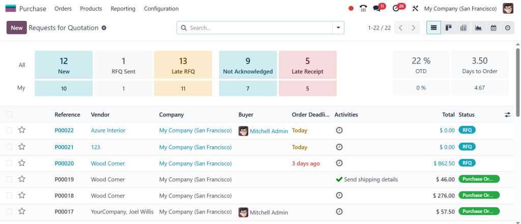
These focused metrics make it easier for you to monitor your purchasing efficiency. Overall, these changes give you a smoother and smarter way to manage RFQs and track supplier performance within the Purchase module.
Odoo 18.2 Purchase App UX Enhancements
As you explore deeper, the Odoo 18.2 Purchase App UX enhancements will surprise you with how much faster, cleaner, and more enjoyable your daily tasks have become. Imagine creating purchase orders with minimal clicks and finding your vendor records in seconds. These enhancements aren’t surface-level; they go right into the core of your workflow.
The experience is no longer about filling forms; it’s about confidently commanding your procurement process. Odoo has optimized every action, from RFQ creation to vendor bill validation, making complex operations refreshingly simple. For those who’ve struggled with earlier versions, the shift in Odoo 18.2 feels like stepping into a well-lit room after searching in the dark, and once you taste this new ease, there’s no going back.
Odoo 18.2 Purchase App New Features That Will Make You Reimagine Procurement
Curious about what makes this version stand out? The Odoo 18.2 Purchase App’s new features truly redefine expectations. One standout is the imaginative action menus, floating, adaptive buttons that appear right when and where you need them, no more hunting through dropdowns or clicking through tabs.
You’ll also discover upgraded vendor management tools that allow bulk actions and instant filtering, saving hours every week. And if that’s not enough to pique your curiosity, the app introduces real-time validation checks during data entry, eliminating mistakes before they happen. Every new feature feels like Odoo is reading your mind, anticipating your next move, and smoothing the path ahead. It’s the upgrade that excites you to explore every corner of the app.
Odoo 18.2 Purchase App User Interface Changes
Let’s talk about visuals. The Odoo 18.2 Purchase App user interface changes are the most visible signs of the evolution. It’s not just about pretty icons, though they’ve been upgraded. The layout has been reimagined to minimise distractions and highlight the needed information. Forms are leaner, menus are more intuitive, and key actions are now under your fingertips.
The contrast, spacing, and colour choices create a sense of calm and order, making you feel in control even during the busiest procurement cycles. It’s a visual language that speaks efficiently, encouraging you to get things done faster and with fewer errors. Every screen you open feels like it’s been personalized for clarity and speed, and that’s the kind of change that builds loyalty among users.
Odoo 18.2 Purchase App Design Update
Behind this smoother experience is the thoughtful Odoo 18.2 Purchase App design update. Odoo has a minimalist design philosophy that clears the clutter while amplifying functionality. By stripping down to essentials and using visual cues intelligently, the design update makes you more productive without making you work harder. You’ll notice subtle touches, like hover tooltips that explain fields, dynamic status badges that instantly tell you where things stand, and collapsible sections that help you focus only on what matters.
This new design doesn’t shout for attention; it guides you quietly but confidently, so your procurement team can deliver faster results without mental fatigue. It’s modern, clean, and the app has grown up to meet the demands of today’s fast-paced businesses.
Odoo 18.2 Purchase App Usability Improvements
If you’re wondering where the magic happens, it’s in the Odoo 18.2 Purchase App usability improvements. Usability is the secret sauce that turns an average tool into an indispensable one, and Odoo 18.2 nails it. With enhanced filtering tools, you can zero in on that overdue purchase order (PO) or pending RFQ with astonishing speed. Bulk-editing records no longer feels like a chore; it’s smooth and satisfying.
Field autofill features anticipate your entries, saving you keystrokes, while drag-and-drop functionalities give you total control over lists and dashboards. These usability tweaks might sound small, but they add to a turning point experience where every task you perform feels like a triumph, not a struggle. It’s a subtle yet powerful shift that will have your team smiling at the end of a busy day.
Odoo 18.2 Purchase App Layout Redesign
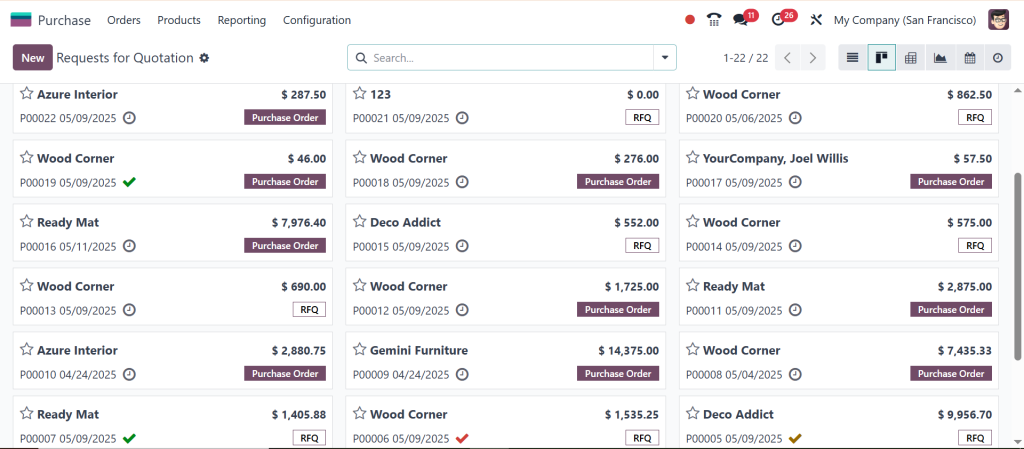
And then, there’s the Odoo 18.2 Purchase App layout redesign, a cornerstone of this transformation. Forget everything you knew about rigid, static layouts. Odoo 18.2 introduces a dynamic, responsive design that adapts to your screen and needs.
Whether you’re reviewing purchase orders on a widescreen desktop or approving vendor bills on a tablet, the layout adjusts flawlessly. Split-screen views let you compare data side by side, while card views and enhanced Kanban boards give you a bird’s-eye view of your operations. The redesign is more than cosmetic; functional brilliance helps you multitask like a pro. By optimizing every inch of screen real estate, Odoo ensures that every click, swipe, and scroll brings you closer to your goals with zero friction.
Why Odoo 18.2 Purchase App Redefines User Experience
The story of how the UI/UX improved in Odoo 18.2 Purchase App is not just about features, but how software can truly evolve to serve its users better. Every layer, from the Odoo 18.2 Purchase App UI improvements to the Odoo 18.2 Purchase App UX enhancements, has been thoughtfully crafted to make your daily work more efficient, enjoyable, and impactful.
With its powerful Odoo 18.2 Purchase App new features, fresh user interface changes, elegant design update, radical usability improvements, and intelligent layout redesign, Odoo 18.2 doesn’t just raise the bar; it sets a new standard for what business apps should aspire to.
Once you experience this transformation, you’ll find yourself not just using the Purchase App but truly enjoying it, and that’s a rare and valuable upgrade in any business tool.